

10 Décor Ideas for Pairing Paint-by-Numbers with Furniture
- by Paint by number online
-

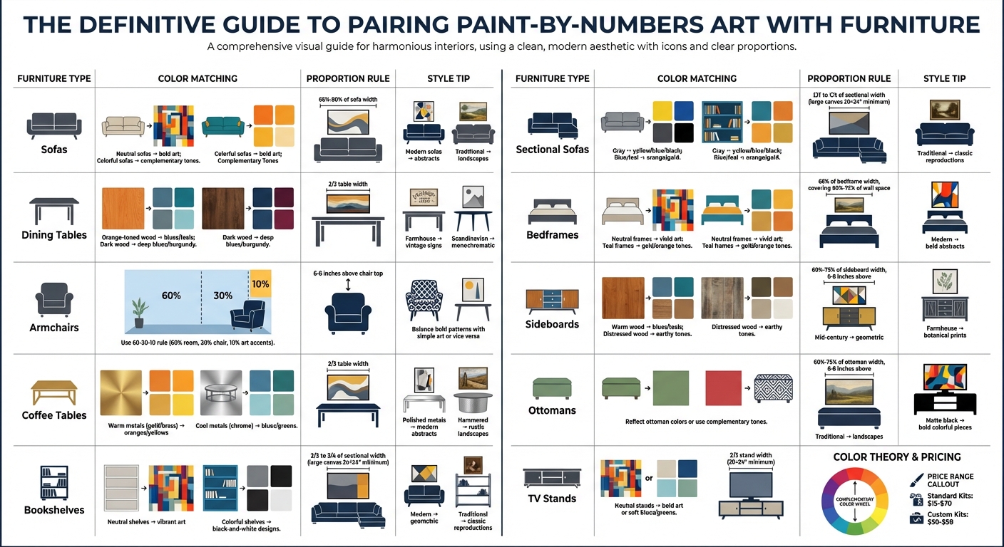
Paint-by-numbers art isn’t just a fun hobby - it’s a budget-friendly way to personalize your home décor. Pairing your finished artwork with furniture can make your space feel more polished and reflective of your style. Here’s how to match colors, textures, and proportions across different furniture types:
- Sofas: Match neutral sofas with bold art or colorful sofas with complementary tones. Ensure the artwork spans 66%-80% of the sofa’s width.
- Dining Tables: Coordinate wood tones with artwork colors (e.g., blues with orange-toned wood) and match styles like farmhouse or Scandinavian.
- Armchairs: Use the 60-30-10 rule for color harmony, balancing bold patterns with simple artwork or vice versa.
- Coffee Tables: Align metal finishes (e.g., gold or chrome) with artwork frames and colors for a cohesive look.
- Bookshelves: Pair neutral shelves with vibrant art or colorful shelves with black-and-white designs for balance.
- Sectional Sofas: Choose large or multi-panel art covering two-thirds of the sofa’s width for proper scale.
- Bedframes: Match artwork themes with bedframe styles (e.g., landscapes for wooden frames) and aim for 66% width coverage.
- Sideboards: Complement textures (e.g., rustic wood with textured art) and follow the two-thirds width rule.
- Ottomans: Reflect ottoman colors in your art or use complementary tones for contrast.
- TV Stands: Pair minimalist stands with bold or subtle artwork, depending on your desired effect.
Whether it’s coordinating colors, balancing textures, or getting proportions right, these tips help integrate your art into your home seamlessly. Paint-by-numbers kits, priced between $15-$70, offer an affordable way to create art that elevates your décor.
Paint-by-Numbers Art Placement Guide: Furniture Pairing Rules and Proportions
1. Match Colors with Upholstered Sofas
Color Matching
The color of your sofa plays a big role in picking the right paint-by-numbers artwork. Neutral sofas - think beige, cream, gray, or charcoal - create the perfect backdrop for bold, high-contrast pieces to shine . A vibrant landscape or a colorful abstract design can bring energy and personality to a room anchored by neutral tones.
If your sofa is already colorful, you have two options: match its hues for a harmonious look or choose contrasting colors to create visual drama . For example, a teal or blue sofa pairs beautifully with warm orange or gold tones, following the principles of complementary color theory. You can also think about the mood you want to set - blue is calming, green feels balanced, and yellow or orange adds warmth and energy .
Once you've nailed the colors, make sure the artwork’s theme fits the vibe of your sofa.
Style Coordination
The style of your sofa and artwork should work together seamlessly. Sleek abstract designs pair nicely with modern minimalist sofas, while detailed landscapes or classic reproductions feel at home above traditional furniture . Mid-century modern sofas look fantastic with geometric abstracts, and boho-inspired furniture welcomes florals or intricate patterns .
"A painting above your couch is not just décor; it's a daily companion that influences how you feel when you're resting, entertaining, or simply passing through."
– Yvoni, Artist
Scale and Proportion
When it comes to art, size makes a difference. Ideally, your artwork should span 66% to 80% of your sofa’s width . For large sectionals, go with substantial canvases or even a triptych to keep the proportions balanced. Most paint-by-numbers kits measure around 20" × 16" (50 cm × 40 cm) . To get the scale right, use painter’s tape to outline the dimensions of the canvas on your wall before hanging .
Texture Pairing
The texture of your sofa’s fabric also matters. If you have a richly textured material like velvet or bouclé, a simpler, more calming paint-by-numbers design can help avoid visual overload . The artwork’s finish is another detail to consider - a glossy varnish can make colors pop and contrast beautifully with textured fabrics, while a matte finish works well with flat-weave upholstery . To tie everything together, extend the artwork’s colors into the room with matching pillows and throws .
sbb-itb-68cf19f
2. Complement Wood Textures on Dining Tables
Color Matching
Wood finishes come with distinct undertones - like yellow, orange, red-brown, bluish-brown, or gray - that play a big role in setting the mood. Identifying these undertones is the first step before picking artwork. For pine or honey-toned tables, medium greens, soft yellows, or pale gray-greens can add warmth and contrast. Orange-toned wood comes alive with bold blues, teals, or navy shades. Dark woods like mahogany or walnut pair beautifully with deep blues, burgundy, plum, or even stark whites for a more dramatic or refined look. If you want the furniture to pop, go for high-contrast combinations, like dark wood with light-colored artwork. For a more understated vibe, stick to low-contrast tones that blend seamlessly.
"Remember where your oak furniture came from in the first place - the forest - and use colours naturally found in wooded landscapes to compliment it, like creams, greens, browns and blues."
– Clara Nelson, Interior Designer
These color tips help tie your artwork and furniture together effortlessly.
Style Coordination
Your artwork’s theme should reflect the style of your dining table. For modern farmhouse tables, vintage signs, typography, or neutral abstract pieces fit the bill. Traditional wood tables shine alongside landscapes, still lifes, or classic portraits. Scandinavian tables work best with monochromatic or black-and-white designs, while mid-century modern tables thrive with geometric abstract art. Matching the art’s vibe to the table’s style creates a cohesive, polished look.
Scale and Proportion
To maintain balance, the artwork’s width should be about two-thirds the width of your dining table or the sideboard it hangs above. This proportion ensures the artwork feels integrated without overpowering the space. A quick tip: Use painter’s tape to outline potential canvas dimensions on the wall before committing.
Texture Pairing
If your table has a prominent wood grain, choose simpler, calming artwork - like a minimalist paint-by-numbers piece - to avoid visual clutter. Open-grained woods, such as oak, naturally add shadow and warmth, making textured artwork an excellent choice to enhance the room’s tactile feel. Keep in mind that wood tones can shift under different lighting, so observe how the colors interact throughout the day.
Turn Paint by Numbers Into Home Decor || Easy DIY Art Display Tutorial || z9designs
3. Coordinate with Armchair Fabrics
When it comes to seating areas, armchairs offer a great chance to blend art with upholstery and texture, creating a visually cohesive space.
Color Matching
Try using the 60-30-10 rule to guide your color choices: 60% of the room's dominant color, 30% from the armchair, and 10% from the artwork’s accents. Let the armchair’s upholstery or accent pillows inspire the painting's palette for a unified look.
For contrast, turn to the color wheel. For example, a navy blue armchair pairs beautifully with artwork in orange or gold tones, bringing energy to the space. If you prefer a calming vibe, go for analogous colors - pair a teal armchair with paintings that feature blues and greens. On the other hand, if the armchair has a bold or patterned fabric, balance it with neutral or monochromatic art to avoid visual overload.
| Armchair Color | Suggested Art Colors | Effect |
|---|---|---|
| Gray | Yellows, blues, or pinks | Adds warmth or keeps it cool |
| Navy/Blue | Orange, gold, or copper | Delivers bold, dynamic contrast |
| Brown/Wood Tones | Greens, blues, or earth tones | Creates a natural, balanced feel |
| Black | Bold, saturated colors | Adds drama and sophistication |
| White/Cream | Vibrant colors | Lets the art take center stage |
Table adapted from.
Style Coordination
The style of your artwork should complement the design of your armchair. For instance, mid-century modern chairs pair well with geometric abstracts, while traditional wingback chairs look great with landscapes or still lifes. That said, mixing styles can also be effective - an ornate painting can pop against a sleek, modern chair, while a traditional chair can ground a bold, contemporary canvas.
"The most interesting rooms are built on connection, not perfection. Your art and furniture should speak to each other in small, thoughtful ways through color, tone, texture, or feeling."
– Artfully Walls
Texture Pairing
Texture adds another layer of harmony between your armchair and artwork. For example, a structured leather chair pairs beautifully with soft, botanical art to soften the look. If your armchair features heavy, woven fabric, stick to simpler artwork to avoid overwhelming the space. To tie everything together, consider adding a throw pillow or blanket that reflects the painting's colors. This balance of texture and color creates a cohesive and inviting focal point.
Scale and Proportion
When hanging art above an armchair, pay attention to scale and placement. The artwork should match the chair's visual weight without overpowering it. Ideally, hang the piece so its bottom edge is 6 to 8 inches above the top of the armchair, ensuring a clear and intentional connection between the two elements.
4. Echo Metal Accents on Coffee Tables
When it comes to tying together colors, textures, and materials in your space, incorporating metal accents on coffee tables can add an extra layer of sophistication. Whether it’s gold legs, chrome frames, or copper hardware, these metallic details can create a sense of visual harmony with your artwork and décor. The trick lies in understanding how these finishes interact with color, texture, and style.
Color Matching
Metals generally fall into two categories: warm-toned (brass, copper, gold) and cool-toned (silver, aluminum, chrome). Neutral options like blackened gunmetal and wrought iron can pair well with either group. For a cohesive look, match warm metals with colors like oranges, yellows, and earthy tans, while cool metals complement blues, greens, and grays. To tie it all together, choose a frame for your artwork that mirrors the finish of your coffee table - think sleek silver for chrome or gold-leaf for brass accents.
Style Coordination
The finish of your coffee table’s metal can guide the art style you select. For example:
- Polished metals like chrome or gold work well with modern, minimalist designs and pair beautifully with abstract patterns or geometric art.
- Brushed metals such as nickel or steel align with eclectic or contemporary styles and shine alongside vibrant cityscapes or pop art.
- Hammered finishes like copper or iron fit perfectly into rustic or vintage themes and look stunning with landscapes or botanical pieces.
- Antiqued metals like brass or bronze complement traditional settings and pair well with classic recreations or still-life paintings.
"Antiqued and satin finishes look best in traditional settings. Brushed metal complements eclectic and polished styles, hammered finishes suit rustic and vintage looks, and polished metals complete modern and minimalistic rooms."
– Mor Furniture
Texture Pairing
Texture is another key factor in creating a cohesive look. A matte finish on your artwork can create a cozy contrast with the high shine of polished metals. On the other hand, a glossy finish on your painting can mimic the reflective qualities of metals like copper or gold, creating a modern, unified aesthetic. For brushed or antiqued metals, artwork with weathered or distressed textures adds depth without feeling overly similar.
Scale and Proportion
To achieve balance, follow the two-thirds rule: your painting’s width should be about two-thirds the width of your coffee table. This creates a visually pleasing composition that feels proportional to the space.
5. Match Bookshelf Tones
Bookshelves are more than just storage - they're part of your décor's personality. The tones, materials, and finishes of your bookshelf can either enhance or clash with your paint-by-numbers artwork. Getting the balance right is key to creating a space that feels unified and visually appealing.
Color Matching
The color wheel can be your best friend when coordinating bookshelves and artwork. Neutral-toned shelves in shades like beige, gray, or white give you plenty of options. Pair them with soft blues or greens for a calming vibe, or go bold with reds and oranges to inject energy. On the other hand, if your bookshelf already features bright colors, black-and-white or monochromatic artwork can help tone things down and create balance.
For a more curated look, use complementary colors (like blue and orange) to create striking contrasts or analogous colors (like blue and green) for a more seamless, soothing effect. Another idea? Pick a subtle color from your bookshelf - maybe from a book spine or a decorative item - and choose a paint-by-numbers kit that highlights that shade to tie everything together.
Style Coordination
Your bookshelf's design can guide your artwork choices. Classic wooden shelves work well with landscapes or still-life pieces, while minimalist or metal shelves are better suited for abstract or geometric designs. If your bookshelf leans modern or industrial with metal details, opt for sleek monochromatic abstracts or typography art to keep the aesthetic sharp. Bookshelves also let you get creative by layering books, art, and decorative objects, adding depth and interest to the overall look.
Texture Pairing
Frames and finishes can echo your bookshelf’s material for a cohesive feel. Wood frames pair naturally with wooden shelves, while sleek metal frames complement metal or laminate designs. To go a step further, consider applying a matching finish to your artwork. For instance, a gloss varnish can mirror polished laminate shelves, while a matte finish works beautifully with rustic wood.
"The finishes on your furniture (e.g., matte, glossy, rustic) can also influence which art pieces will work best."
– Cosimo Art
Scale and Proportion
When it comes to size, the two-thirds rule is a helpful guide: your canvas should be about two-thirds the width of your bookshelf. Before committing, use painter's tape to outline the dimensions on your wall. This trick helps you visualize how the artwork will fit and ensures the proportions feel just right.
6. Balance Scale with Sectional Sofas
Sectional sofas are bold statement pieces that demand equally striking artwork to maintain a cohesive look. Getting the proportions right between your artwork and sectional is key to achieving a harmonious décor.
Scale and Proportion
Design experts suggest that artwork should cover between two-thirds and three-quarters of the sectional's width. For example:
- An 84-inch sectional pairs well with artwork measuring 56 to 63 inches wide.
- A 96-inch sofa calls for artwork between 64 and 72 inches wide.
- A 108-inch sectional fits best with pieces 72 to 81 inches wide.
"A small piece of art above a large sofa looks like an afterthought."
– The Painting Advice
For L-shaped sectionals, measure the longest continuous wall section behind the seating to determine the appropriate artwork size. A single large canvas - typically 20×24 inches or larger - can anchor the space effectively. If one piece isn't enough, consider a gallery wall where the combined dimensions meet the two-thirds rule. Use painter’s tape to outline the size on the wall before committing.
Color Matching
Neutral sectionals in shades like beige, gray, or white offer a blank canvas for either bold, vibrant artwork or softer tones like blues and greens. For example:
- Gray sectionals pair well with yellow for warmth, blue for a cool vibe, or black for a dramatic contrast.
- Blue or teal sectionals shine with warm accents like orange, gold, or copper for added energy.
- Black sectionals look striking with saturated colors or a mix of white and metallic tones for a sleek, contemporary feel.
These color combinations can guide your choice of artwork, ensuring it complements the sectional while enhancing the room's overall design.
Style Coordination
The style of your sectional often dictates the type of artwork that works best:
- Modern sectionals with clean lines pair beautifully with abstract or geometric designs.
- Traditional sectionals with rolled arms are better suited to landscapes or classic art reproductions.
- If your sectional features bold patterns or heavy textures, choosing minimalist artwork can help maintain visual balance.
Texture Pairing
Flat, paint-by-numbers canvases can be elevated by mixing in textured décor. Consider adding woven wall hangings, metal accents, or other dimensional pieces above your sectional. The frame choice also matters: sleek, minimalist frames complement modern sectionals, while wooden or ornate frames are a natural fit for rustic or traditional styles.
7. Match Bedframe Styles in Bedrooms
Creating a cohesive and inviting bedroom often comes down to how well your bedframe and artwork work together. The bedframe sets the room's tone, and the right art can enhance that vibe. By aligning style, color, and texture, you can transform your bedroom into a harmonious retreat.
Style Coordination
Different bedframe styles naturally lend themselves to specific types of artwork:
- Traditional wooden bedframes pair beautifully with landscapes, still lifes, or timeless reproductions.
- Modern frames shine alongside bold abstracts or geometric designs.
- Mid-century modern frames complement op-art or futuristic expressionism, especially in muted tones.
- Coastal or light wood frames benefit from artwork with watery elements, such as blues, greens, and whites.
"The bedroom should be a sanctuary, and the artwork you choose can contribute significantly to a calming atmosphere."
– AllPaintbyNumbers
Rustic or farmhouse bedframes look great with botanical pieces or neutral abstracts, while eclectic or boho styles can embrace vibrant patterns and figurative prints. For these, complementary color schemes - like teal and orange - add extra flair.
Color Matching
Neutral bedframes in shades like beige, gray, or natural wood act as a blank canvas, allowing vivid paint-by-numbers pieces to take center stage. If your bedframe is colorful, you can either echo its hues for a harmonious look or create contrast with complementary colors. For instance, a teal bedframe pops when paired with artwork featuring warm gold or orange tones. To maintain a calming atmosphere, opt for colors that promote relaxation, such as blues, which are known to reduce stress.
Scale and Proportion
When it comes to size, balance is everything. Aim for artwork that’s about two-thirds (66%) the width of the bedframe to keep the proportions visually pleasing. The piece should also cover 60% to 75% of the wall space above the bed. For larger bedframes, go for a substantial canvas - 20×24 inches or bigger - or a multi-panel triptych to anchor the space. Use painter’s tape to test placement before committing.
Texture Pairing
The material and finish of your bedframe can guide your choice of artwork texture:
- Matte or rustic wood frames pair well with textured, organic subjects.
- Glossy or metallic frames enhance sleek, high-contrast abstracts.
- Wood bedframes work wonderfully with canvases that showcase a visible weave, echoing the natural grain.
- Metal bedframes are best complemented by minimalist or modern abstract designs in floating frames.
For added cohesion, consider framing your paint-by-numbers piece in wood to match a wooden bedframe. Alternatively, gallery-wrapped canvases - where the paint extends around the sides - offer a contemporary look that seamlessly integrates with the room. By carefully harmonizing your bedframe and artwork, you can create a bedroom that feels both stylish and serene.
8. Accent Sideboard Textures
Sideboards are more than just functional furniture - they're a key design element in dining rooms, entryways, and living spaces. The texture and finish of your sideboard can set the tone for the entire room, and pairing it with the right artwork can tie everything together beautifully. Whether your sideboard is matte, glossy, or distressed, selecting art that complements its texture and style creates a cohesive and polished look. The trick lies in matching the canvas's texture and finish to the character of the sideboard.
Texture Pairing
The texture of your sideboard should guide your approach to preparing and finishing your artwork. For example, a rustic wooden sideboard with visible grain pairs wonderfully with textured brushstroke paintings, emphasizing a natural and organic vibe. On the other hand, a lacquered or polished sideboard calls for a smoother, sleeker canvas. To achieve this, you can sand your dried painting with fine-grit sandpaper, then apply a thin coat of clear gesso before varnishing for a refined finish.
"A room with plenty of textures may benefit from a calming, simplistic painting to feel less busy." – Chairish
When it comes to varnishing, choose a finish that complements the sideboard. Glossy varnish enhances color vibrancy and works well with modern, polished furniture, while matte varnish provides a muted, non-reflective finish perfect for rustic or mid-century modern pieces. A great example is Corinne Schmitt's DIY project on Shrimp Salad Circus, where she added a botanical paint-by-numbers design to an IKEA MÖCKELBY oak bench. She sealed it with matte varnish to maintain the wood's natural texture and achieve a consistent, understated look.
Style Coordination
The style of your sideboard should guide your choice of artwork. For mid-century modern designs, geometric abstracts or atomic-age patterns in tapered wood frames are a great fit. Farmhouse or rustic sideboards pair beautifully with botanical prints, landscapes, or still lifes in distressed wood frames. Scandinavian styles, known for their simplicity, look striking with minimalist line drawings in light wood tones. Meanwhile, contemporary sideboards shine when paired with bold, large-scale abstracts in sleek metal or slim black frames.
Scale and Proportion
Getting the scale right is just as important as choosing the right art. Follow the two-thirds rule - your artwork should cover about 60% to 75% of the sideboard's width. For example, if your sideboard is 60 inches wide, aim for a canvas between 36 and 45 inches wide. Hang the artwork 6 to 8 inches above the sideboard to create a visual link without leaving too much empty space. To ensure the proportions feel right, use painter’s tape to outline the canvas dimensions on the wall before hanging.
Once you've nailed the size and placement, let the sideboard's color palette guide your choice of art. This ensures a seamless visual flow between the furniture and the artwork.
Color Matching
The color of your sideboard can either complement or contrast with your artwork. Neutral-toned sideboards in beige, gray, or cream allow bold paint-by-numbers art to take center stage. Warm-toned wood pieces with orange or yellow undertones look stunning with artwork featuring blues or teals for a complementary pop of color. Distressed wood in oak or mahogany pairs harmoniously with earthy tones like tans, beiges, and greens, reflecting the natural world. Don’t forget to consider your room's lighting - artwork in dining areas or entryways should remain vibrant under warm evening light, enhancing the overall ambiance of the space.
9. Work with Ottoman Patterns
Ottomans are more than just functional furniture - they can be a centerpiece of design, offering a chance to play with patterns, colors, and textures. When paired thoughtfully with paint-by-numbers artwork, they can elevate the entire room’s aesthetic.
As interior designer Mary Lee Smyth from La-Z-Boy says, "Most people tend to go the easy way and get an ottoman that has the same style because they think it works better for their living room... You don't have to go this route every time. Picking an ottoman that isn't from the same furniture family is always an option if you're looking for more diversity in your pieces". This mindset opens the door to mixing and matching for a truly unique space.
Color Matching
Ottoman patterns provide a ready-made color scheme to work with. To create harmony, pick one or two dominant colors from the ottoman and reflect them in your paint-by-numbers artwork. For example, if your ottoman features teal and cream, a painting with similar tones - like a serene landscape - creates a unified look. On the other hand, for a more dynamic effect, use complementary colors. A teal ottoman paired with artwork in warm oranges or golds introduces striking contrast and energy to the room. Before committing, test fabric swatches in your home’s natural lighting to ensure everything works together.
Style Coordination
The ottoman’s style should guide your choice of artwork. Traditional ottomans with damask or floral prints pair well with classic themes like landscapes, still lifes, or portraits. Geometric patterns on mid-century modern ottomans are best complemented by abstract or expressionist designs. If your ottoman leans boho or eclectic with bold, mixed patterns, opt for florals, figurative prints, or pattern-based art that amplifies the room’s vibrant energy.
Texture Pairing
Balancing textures is key. High-texture ottomans - like tufted velvet or woven fabrics - work best with artwork featuring broad, simple brushstrokes. Abstract or minimalist designs can help prevent the space from feeling visually overwhelming. Conversely, smooth leather or sleek fabric ottomans benefit from detailed art, such as intricate urban landscapes or floral designs, which add the texture the furniture lacks.
Scale and Proportion
Keep proportion in mind when placing artwork near your ottoman. Follow the two-thirds rule: the artwork should cover 60% to 75% of the ottoman’s width. For example, if your ottoman is 36 inches wide, hang the art about 6 to 8 inches above it for a balanced look. If a single canvas feels too small, consider a gallery-style arrangement with multiple pieces to achieve the right scale and create a cohesive display.
10. Pair with Minimalist TV Stands
Minimalist TV stands offer a clean and neutral backdrop that beautifully complements your paint-by-numbers artwork. Their simple lines and finishes - whether matte black, natural oak, or high-gloss white - set the stage for art that can either blend subtly into the room or stand out as a bold centerpiece. This approach ties in seamlessly with earlier tips about harmonizing color, style, and texture across your décor.
Color Matching
Neutral TV stands in shades like beige, cream, or gray provide the perfect canvas for bold artwork to take the spotlight. On the other hand, white, black, or natural wood stands can highlight an accent color, such as deep blue, which can also be echoed in nearby decorative pieces. For a serene and cohesive vibe, pair a neutral stand with soft blues or greens - blue tones, in particular, are known for their calming effect in living spaces. Monochromatic abstracts featuring black, white, and gray gradients pair effortlessly with Scandinavian minimalism, while earthy tones like tans and beiges align well with modern farmhouse styles without overwhelming the aesthetic.
Style Coordination
Abstract designs featuring geometric patterns or botanical elements add warmth and visual interest without creating clutter. If your TV stand includes ribbed or slatted wood details, consider artwork with linear patterns to mirror those textures. For stands with matte black or metallic finishes, opt for bold and colorful pieces from collections like the "Famous Art" series to create a striking focal point.
"For Modern & Minimalist Spaces: Look for bold designs with clean lines. Our Abstract Collection is perfect for adding a splash of colour without overwhelming a simple aesthetic." – William Murdock, Founder of Paint on Numbers
Texture Pairing
Beyond style, texture plays a crucial role in creating a cohesive look. High-gloss or stone-finish stands pair beautifully with textured linen canvases featuring scumbling techniques (a method where a nearly-dry brush is dragged across the surface). For a polished appearance, choose artwork with a matte varnish finish. Natural wood stands, on the other hand, are best complemented by botanical or landscape paintings that reflect organic textures.
Scale and Proportion
Getting the proportions right is essential for a balanced look. A good rule of thumb is to select a canvas that is about two-thirds the width of your TV stand. Large-format pieces - at least 20×24 inches - work well to ground the space visually. Before hanging, visualize the placement on the wall and consider frameless canvases or minimalist frames to maintain the clean, simple aesthetic.
Conclusion
Pairing paint-by-numbers artwork with your furniture transforms individual pieces into a unified design story. By matching colors to your upholstery, reflecting wood textures with botanical prints, or balancing proportions using large-scale canvases, you can achieve a sense of harmony that makes your home feel thoughtfully put together. The artwork doesn't just fill empty walls - it becomes a centerpiece, adding depth, color, and personality that off-the-shelf décor often lacks.
But there's more to it than just appearance. The act of creating your own artwork adds an emotional layer to your space. Investing time and effort into painting makes the finished piece far more meaningful than something quickly bought and hung. Sarah Macklin, Founder of Dream of Home, explains:
"Spend a few evenings painting a canvas and it instantly means more than something you picked up and hung in five minutes. It becomes your artwork".
This connection - sometimes referred to as the "IKEA Effect" - helps cultivate a home where every item feels intentional and valuable.
Platforms like Paint by Numbers Online make it easy to find kits that suit both your style and skill level. Whether you're drawn to bold abstracts for modern spaces, calming landscapes for bedrooms, or custom photo-to-canvas kits that turn cherished memories into art, there’s something for everyone. Kits are available for a range of budgets, with standard options typically priced between $15 and $70, and custom kits costing around $50 to $58. Explore their collections to find designs that align with your décor - try the Abstract Collection for minimalist interiors, the Famous Art series for classic spaces, or Custom Kits to create a unique statement piece from your own photos.
Each kit includes a wrinkle-free canvas, high-quality acrylic paints, and detailed guides, giving you the tools to create polished, professional-looking artwork that enhances your home’s overall vibe.
FAQs
How do I pick the right canvas size for my furniture?
When selecting a canvas size, think about how it fits with your furniture and the available wall space. Larger canvases are ideal for placing above sofas or beds, creating a sense of balance in the room. On the other hand, smaller pieces are a better fit for cozy furniture arrangements or tighter spaces. To get a clearer sense of how it will look, try holding up a piece of paper or cardboard cut to the same size on the wall. This simple step helps ensure the artwork complements the room, neither dominating the space nor fading into the background.
What if my room already has lots of colors and patterns?
If your room is already full of vibrant colors and bold patterns, stick to neutral or solid-colored furniture to balance things out with your paint-by-numbers artwork. This approach keeps the space from feeling too busy. Instead, lean into textures and soft, understated tones to create harmony in the room while allowing your artwork to take center stage.
Should I use a matte or glossy finish on my painting?
When deciding between a matte or glossy finish for your paint-by-numbers artwork, it ultimately comes down to personal preference and the style you want to create. A matte finish offers a subtle, non-reflective look, perfect if you prefer understated elegance. On the other hand, a glossy finish provides a vibrant, polished effect that makes colors pop and adds a touch of shine. Choose the one that complements your vision for the piece.